Guerrilla User Testing in Jakarta
Context
Summer 2019: I work as a Senior UX Designer at Accedo.tv
A new engagement is signed between Accedo and our client Telkomsel. It includes both Design and Development. We—designers—recommend starting this new phase of work with User Research. The budget is tight, so we advocate for Guerrilla Usability Testing.
Client
Telkomsel is Indonesia’s most popular mobile network operator. It is the largest wireless carrier in the country with 163 million customer base as of 2018. As of 31 March 2015, Telkomsel has 46% of the Indonesian wireless service market share.
Telkomsel provides to its users a video service called MAXstream. It’s an app (iOS & Android) that delivers VOD content via installed 3rd party applications which include Hooq, Viu, Catchplay and SuperSoccer TV.

Challenges
- Rapid Familiarization: quickly getting up to speed with a project I had not previously worked on, as well as understanding the needs of a new client.
- “Fake it till you make it”: traveling to Jakarta to meet the client and presenting myself as knowledgeable and confident about the project.
- Team Preparation: organizing and preparing a team of twelve staff members from the client’s side for guerrilla usability testing.
- Communication: navigating communication challenges despite a language barrier (Bahasa Indonesia).
How
I worked from Accedo Hong Kong with another designer based in our Singapore office.
We established a list of question aiming at getting the most critical feedback for us to address the most impactful sections of the app. We wanted to keep it short and easy to understand: those guerrilla usability testing sessions are meant to be quick. If too long, it’s easy to lose user’s attention and focus.
Given budget restrictions, we had to adopt cheap solutions. So we built our questionnaire within a free solution called Clappia. The form that we created could then be used on three iPads. Each iPad had an ID and every form submission would indicate it alongside with the time of submission.
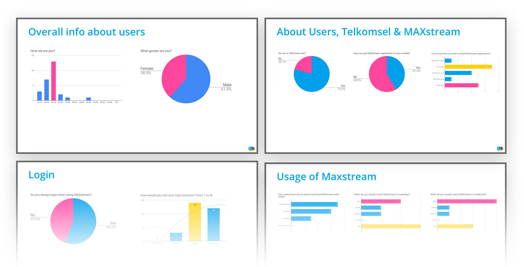
We wanted to collect data about demographics, familiarity with the brand and service, overall perception as well as qualitative data gathered from live usability test (participant interacting with the mobile app).
When – Where
I went to Jakarta for 3 days (Monday 22nd to Wednesday 24th of July 2019). A colleague from our Q.A team went with me as she was Indonesian and could speak Bahasa.
On the first day, we met with the client at their office. I explained what was the goal of this guerrilla user testing session, how we would run it and what was the outcome we wanted to get.
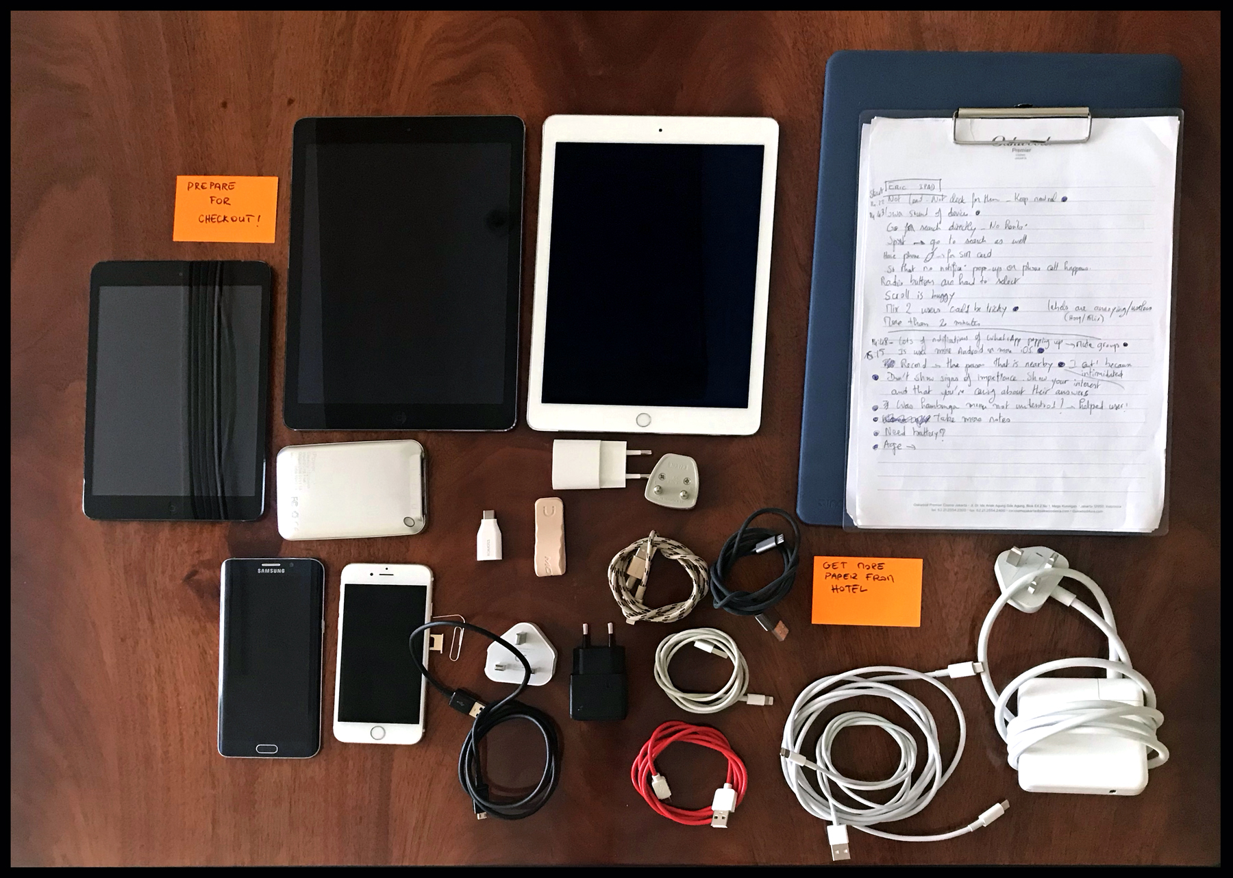
Equipment and tools
- 3 ipads
- 1 Android Phone
- 1 iPhone
- 1 power bank
- 7 cables
- Adapters
- Chargers
- Plastic supports for note-taking
- MacBook Pro
- Post-It
- Paper clip (to insert Telkomsel’s SIM card in our test devices)
- …
Problems faced and solutions found
Language
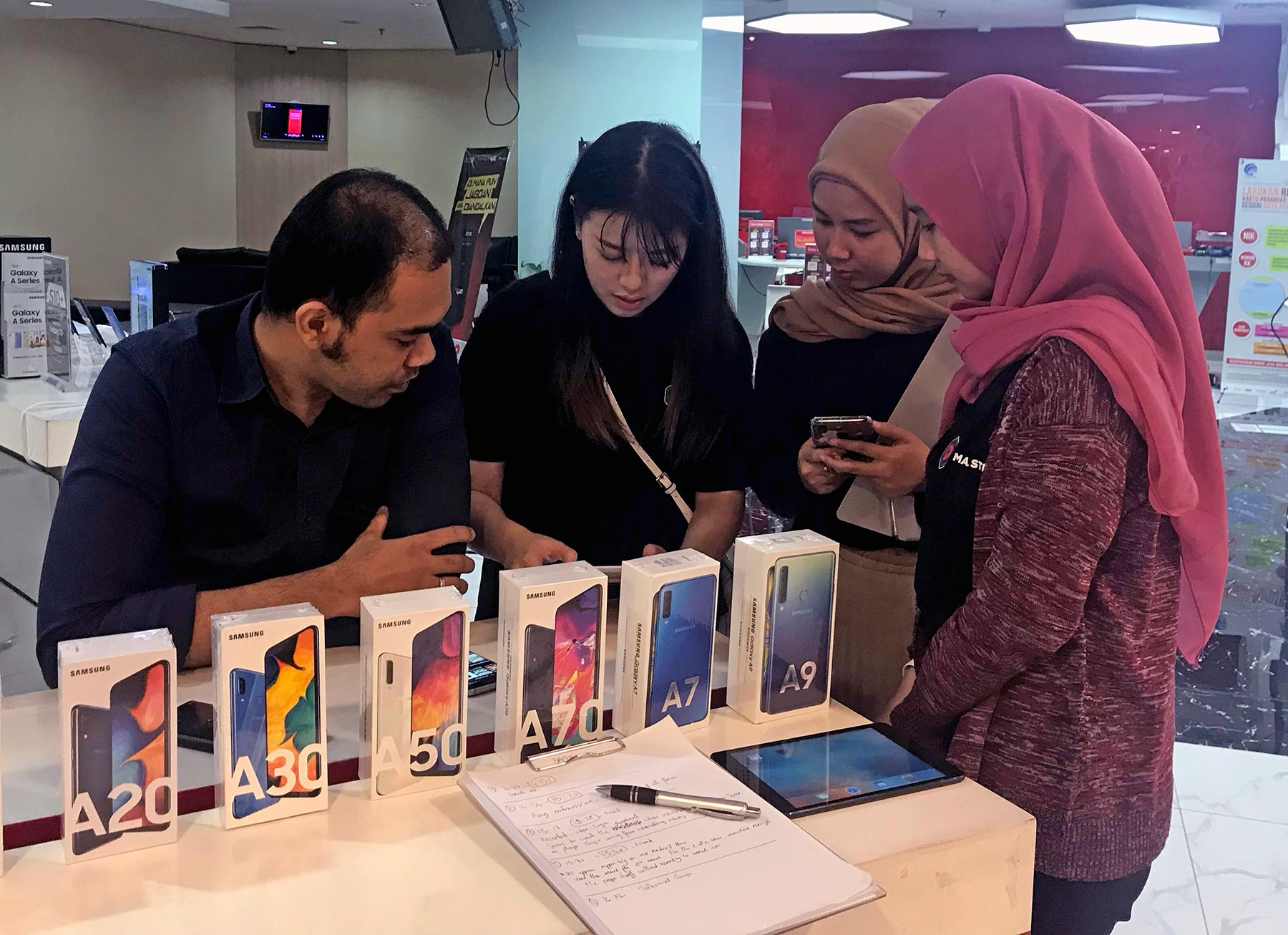
Embarking on guerrilla user testing in a foreign country where one lacks fluency in the local language presents inherent obstacles. Although my Indonesian colleague offered invaluable assistance, we required additional support to acquire a comprehensive data set. Fortunately, Telkomsel’s marketing team supplied personnel to join our efforts, allowing us to assemble 3 dedicated groups for conducting guerrilla interviews. This collaborative approach enabled us to engage a broader pool of participants, enhancing the scope and depth of our research.
Usability Testing isn’t marketing
Conducting user testing interviews differs from leading marketing interviews. The Telkomsel personnel assigned to assist us had limited experience with usability testing protocols. Their backgrounds were primarily in marketing, making them more accustomed to conducting market research interviews rather than evaluating user experience factors. Often, they were tempted to make the interviews longer and add extra questions related to other internal KPIs. However, those questions weren’t relevant in the context of qualitative research. It would have been more useful as part of a quantitative research piece where the numbers can make that feedback exploitable.
Split team
Facilitating 3 teams across disparate locations in an unfamiliar setting presented significant logistical challenges. To maintain effective communication channels, we leveraged the Slack platform, enabling me to provide real-time feedback based on my observations and ensure all teams remained aligned. My Indonesian counterpart proved invaluable, assisting in disseminating messages and instructions.
My duty as a facilitator was to give instructions and rules to follow. As well as telling what not to do, so that we avoid biases, misunderstandings, Hawthorne effect or anything that could affect the quality of the data we would collect.
I would sometime keep some distance so that we don’t intimidate participants by having too many people around them.
My recommendations after the first day
After observing the way we conducted the usability tests on the first day, I sent a message to the team to recap and remind them of the recommendations for this exercise. We had to improve for the second and last day!
Here is what I shared:
- Check that your mobile phone is logged out and the sound at a reasonable level (if too loud, it could embarrass both you and the participant in a public area)
- Take measures so that the interview doesn’t get disturbed by notifications popping up on screen while testing (temporarily mute conversations on messaging apps if necessary)
- Make sure that the iPad is getting network from either WiFi or your nearby Mobile’s personal hotspot (shared network)
- When starting the tasks on device, you can ask participants if they are Android or iOS users and provide the device accordingly—to get closer to their usual environment.
- When asking questions and giving instructions, keep neutral. Don’t lead participants.
- If participants are struggling, hesitating, ask them to think out loud. Write down notes and observations about the source of the confusion (UI screen, UI component, something missing, etc.)
- Based on your experience leading interviews of today, be realistic about the time it will take when approaching people. If your average was about 10-15, you can tell the person it will take about 10 minutes. If you feel that the person isn’t in a hurry during the interview, you can potentially get more into details. If you feel the person gets impatient and wants to leave, react immediately and pro-actively show that you’re going to make it faster.
- Observe body language and adapt accordingly
- Depending on the context, adapt your squad. Sometimes it will be OK to be 3-4 persons (interviewer + observers). Other times, 2 will be the maximum. We don’t want to intimidate our participants. They should feel comfortable during the interview.
- Don’t forget your own body language. Always show interest and show that you care about participant’s feedback.
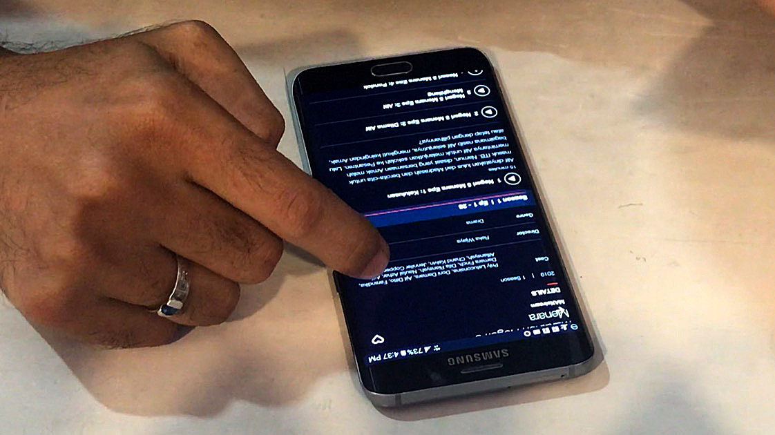
- When participants are interacting with the device, use another device to record the interactions (record video). It’s important to keep records of user behaviours
- Always keep taking notes. If something has been pointed out by a user and is repeated by another one, you should note it down too as it will render statistics. And if 70% of our participants report the same issue, it’s likely that something needs to be improved.
- If you feel the participant is reluctant to give her/his age, you’ll fill in what you think is the age range of the person when you’re away and submit the survey only then.
- Keep each of your notes appended with iPad name and time of submission.
- If participant asks “Should I press this button?” Don’t say “Yes” or “No”. Instead, try to ask why they’re feeling unsure. Ask them to think out loud. Ask them to do what they think is the correct way. Keep neutral when seeing them struggling or succeeding. It’s not about their success or failure. It’s really the app that is being tested.
- Observers -> take notes! The facilitator is already busy with the iPad and typing in on iPad is not as fast as what you can do with your phone or pen and paper. Also, there might be some ‘extra’ conversations being triggered that we want to capture. Precious insights could come up!
- Don’t ask participants to do both the tasks and fill-in the survey on iPad. This is asking too much from them. The facilitator is there to make it easier and should undertake filling-in the survey.
- If a participant holds the device in a way that makes it hard for you to observe, either get closer or gently ask if he/she can hold it so that you can see.
Outcome
Despite the challenges, the very short time and tight budget, we managed to collect sufficient data to be able to make informed design decision for the next phase of work.
Some key improvements uncovered by the guerrilla usability test were:
- adding subtitles on the player: this is the most wanted feature on the player (by 43%)
- adding a “Watchlist” and a “Continue Watching” UI component to encourage the “resume watching” behaviour (only 33.3% of the participants would resume a program that they have started, which is too low)
- improving “Support & FAQ” section (20% of users gave up when facing an issue)
- surfacing more relevant content to users (100% of participants who said they preferred watching sports were males)
- making the service available as a website (48,3% of users would also like to watch on TV)
Also, we were then able to compare those qualitative insights with the quantitative datas extracted from analytics tools. This allowed us to match the ‘WHAT’ (from quantitative datas) with the ‘WHY’ (from qualitative datas) and better understand user patterns.
