
Building a Design System for a SaaS company
Context
In 2023, the InsurTech company where I work as a Product Design Lead recognizes the need to establish a unified, cross-product Design System. I am appointed as the Design System Lead.
Problem statement
The company has multiple revenue-generating products, but their designs have begun to diverge. The different product teams operate in silos, missing opportunities for collaboration. This leads to duplicated components and code, resulting in increased costs and inefficiencies.
Stakeholders
- Designers (HK)
- Developers (India and Philippines)
- QA engineers (India)
- PMs (Sweden and Netherlands)
Role
Design System Lead
International & Distributed Team
Involved right from day one, collaborating daily with:
- 2 PMs based in Europe
- 10+ developers and QA engineers across India and the Philippines
- 1 Dev Lead based in HK
- 4 designers based in HK
Challenges
1. Short time frame to show tangible results to the C-suite
If expectations are not met, the Design System initiative may be aborted.
2. Obligation to drop our current framework (Ant Design)
Its Chinese origin is considered a risk for our US customer base—in a context of political tensions between the USA and China.
3. Balancing dual responsibilities
Leading the new Design System initiative while continuing to drive design for the company’s main product.
Approach
A centralized governance model
After discussions with the PM, Dev Lead, and Head of Design, I proposed a “centralized” governance model (with a dedicated Design System team). This approach was designed to ensure ownership, reliability, and a clear, focused direction. We remained open to adopting a “distributed” or “federated” model in the future, once the system and team matured, but prioritized speed and efficiency in the early stages.
I put forward a flow diagram to clarify how component requests would be processed. Establishing this process early on was crucial to prevent a bloated and unmanageable design system.

MVP strategy
As we were starting a new Design System from scratch and had to discard the Chinese framework we had ben using so far, we were faced with the questions:
- Should we design and code everything ourselves to make the system entirely ours?
- Or should we build on top of an existing framework to save us time, but forcing ourselves to deal with (sometimes breaking) framework updates?
As we didn’t have the luxury of time, the Team and myself decided to leverage the MUI framework based on Material Design from Google.
As we were under pressure to produce results quickly, I began by identifying ‘quick wins’—elements that could be easily addressed and would benefit the most team members by saving time and effort.
To achieve this, I conducted an audit of the designs across the company’s various products, pinpointing common elements that required little to no customization, such as UI components, text styles, and colors.

Extract of the audit I made using Google sheets
I also distributed a form to the product designers responsible for these products to gather data on the styles and UI patterns they were using.
Through this process, I discovered significant misalignments in our products regarding:
- Font face
- Body text size
- Error colors
- Warning colors
- Success colors
- Neutral color palettes
- Icon usage
- Shadows
- Breakpoints
I then organized meetings with the designers to reach consensus on common patterns and practices. This collaboration resulted in:
- A unified font across all products: Noto Sans, which supports multiple languages.
- A consistent color set for error, warning, and success messages, ensuring accessibility.
- A standardized body text size for desktop applications.
For certain aspects, such as breakpoints, we agreed to adhere to the framework defaults to minimize additional work.

The results I received after sending a survey to product designers
From ‘Primitives’ to ‘Semantic Design Tokens’
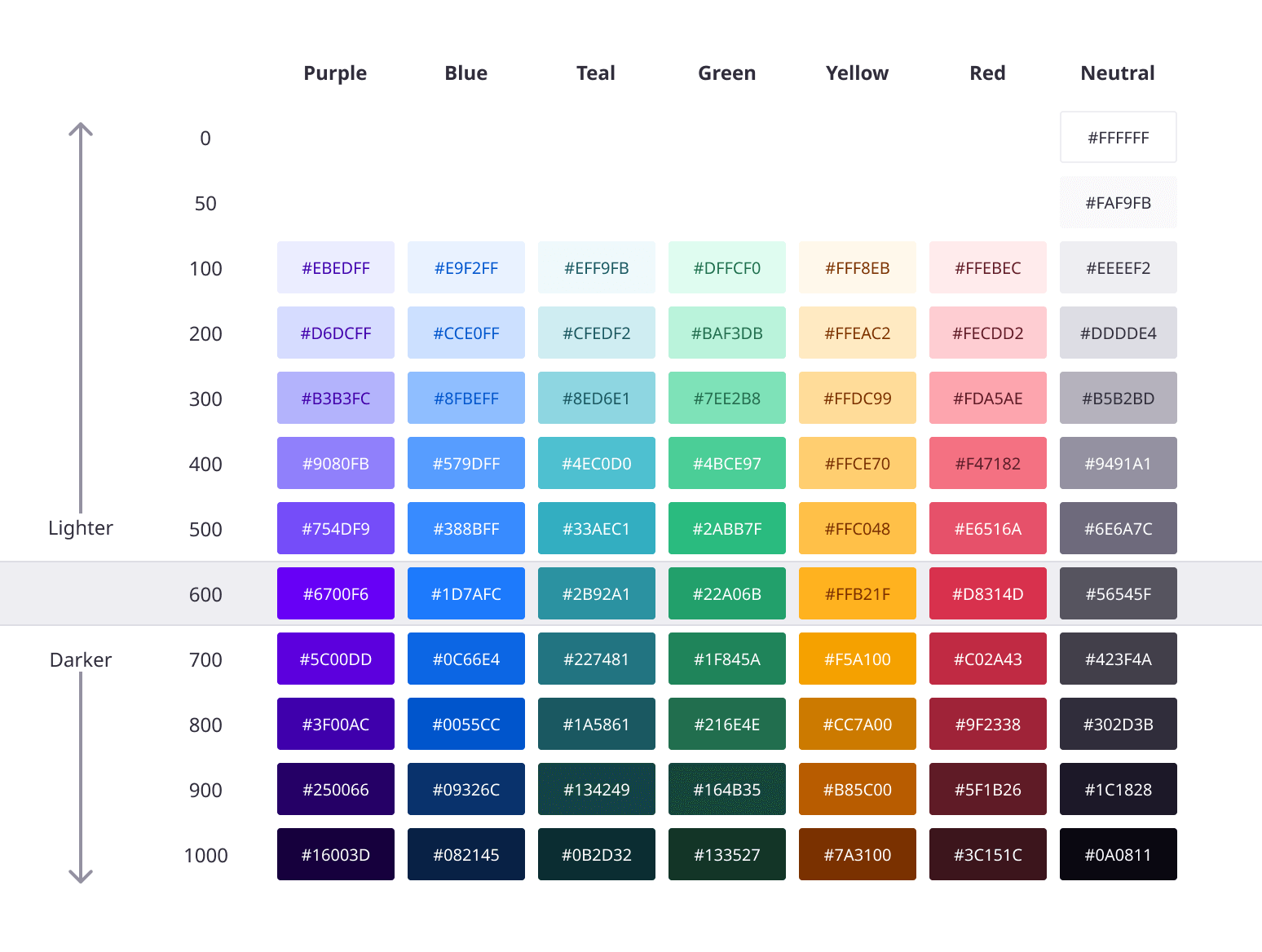
I started by defining our ‘Primitives’. In other words, the core, raw values that define the foundational properties of a design system. The image below shows the base color system. Level 600 represents the most saturated color index.
Example of ‘Primitives’ set within a variable collection in Figma:
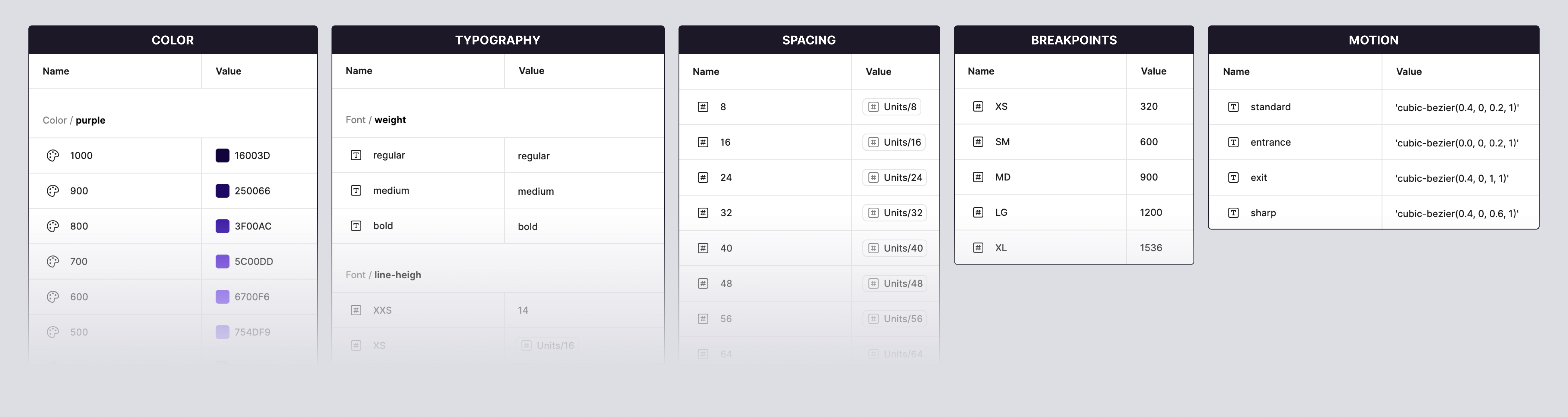
Primitives, alone, lack clarity. They don’t provide guidance on how the properties should be used. This is where design tokens come into the picture. Design tokens are name and value pairings that represent small, repeatable design decisions. Semantic tokens map primitives to actual UI purposes. They describe how a token is used (rather than what it is).
We needed a naming convention that made sense to team members while being scalable. After consulting designers and developers, I proposed a naming structure that our team members felt confident using. It was also flexible enough for the system to grow while minimising structure changes.
Examples of design tokens:

Searchability
When switching from one framework to another, it’s common for some components to have different names. Three examples below:
| Old component name in Ant Design | New component name in MUI |
|---|---|
| Steps | Stepper |
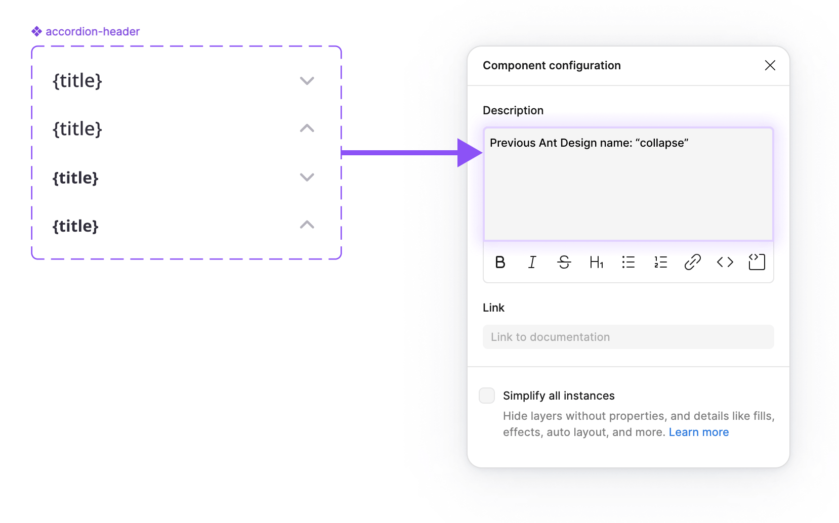
| Collapse | Accordion |
| Segmented | Button Group |
To prevent any disruptions, I informed all teams about these changes. I also wanted to address the possibility that a designer might search for a component in the new Design System using its previous name. By adding a reference to the old name in the component description, I ensured that the appropriate component would be found under its new name.
Aligning Design and Code
Right from the start, my goal was to bridge the gap between design and code. I strived to maintain naming conventions aligned between Figma and code. I believe that designers and developers should speak the same language, and refer to components, colors, and tokens in the same way.
Exemple of a text-field element named “adornment” that can be placed either at the ‘start’ or ‘end’ of the field (following the CSS logical property concept)
")
Documentation
One of the primary challenges companies encounter when investing in a Design System is ensuring its adoption. The time and effort dedicated to refining the details can be wasted if designers and developers don’t use it. This underscores the importance of comprehensive documentation.
After launching the initial components, I began the documentation process. Like the system itself, this would be an ongoing effort.
As we needed a platform that was both flexible and user-friendly, we chose Zeroheight.
Documentation extract (button component):

Documentation extract (Do’s and Don’t):

Tools Of The Trade
MUI
The HTML/CSS/JS framework we used as a replacement of Ant Design.
Material Design
The Design System leveraged by MUI.
Figma
The Interface Design tool.
Storybook JS
The platform for building and testing our UI components in code.
Chromatic
Our visual testing & review tool.
Jira
Our Agile collaboration tool.
Airtable
The platform I used to build a database to manage and track the design system evolution.
Zeroheight
The platform I used to document our design system. This became our source of truth thanks to its synchronisation with the components and code living in Storybook.
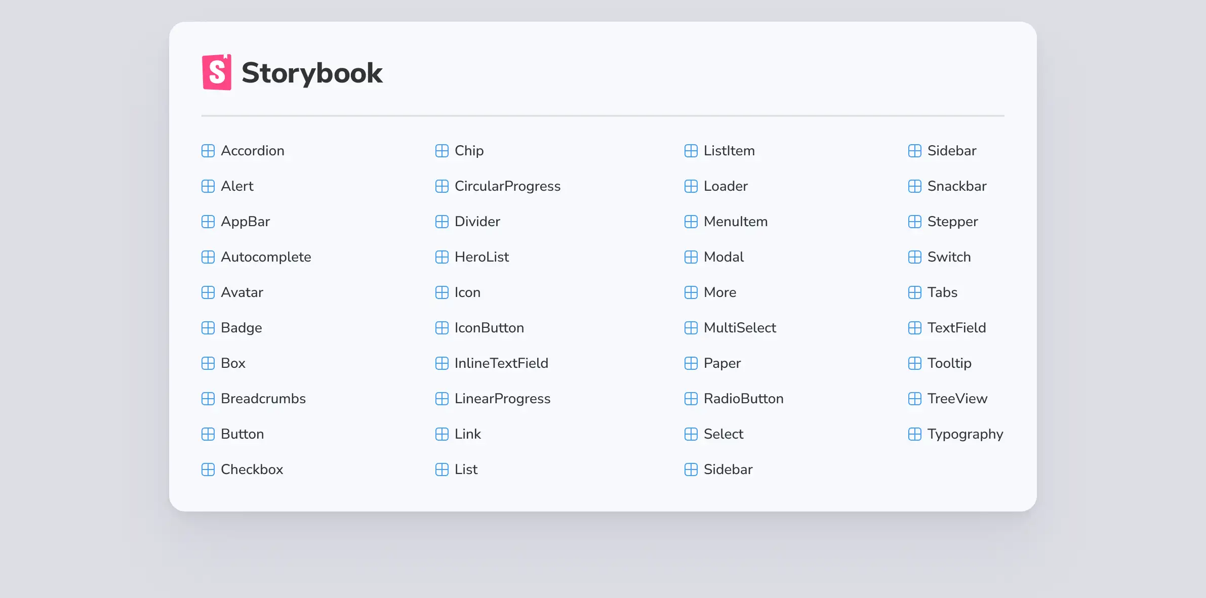
The Storybook component list:
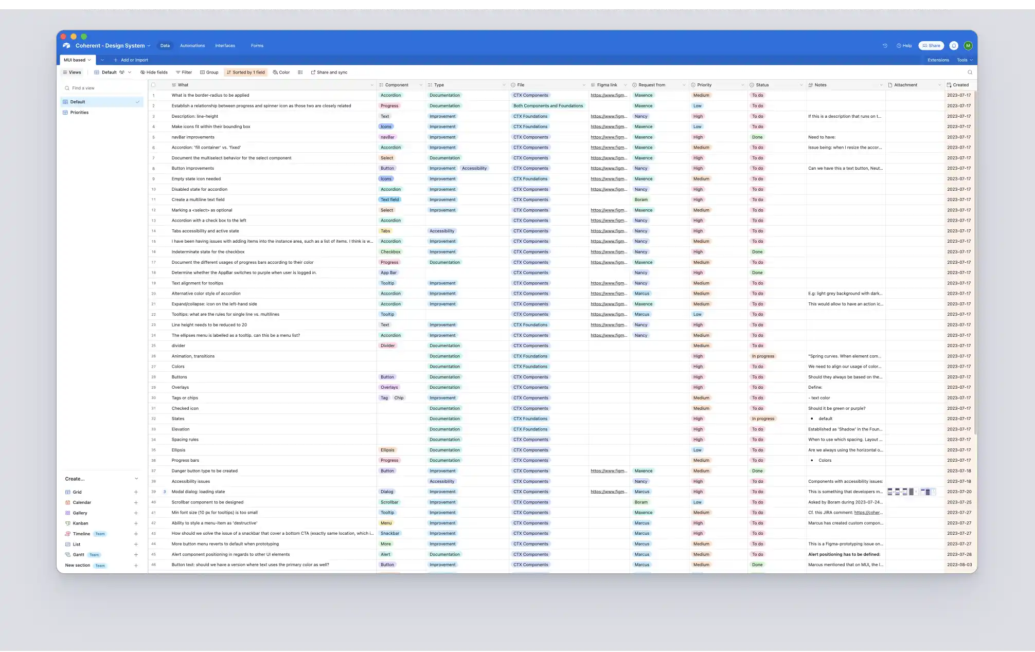
The component library database I built on Airtable to help track our progress:
Impact
Although I didn’t remain long enough at the company after leading the Design System initiative to provide statistics, numbers, and analytics, I observed several key benefits:
- it significantly reduced the time and effort required by both designers and developers, leading to faster turnarounds,
- it improved consistency across the company’s product line,
- it fostered higher engagement among globally distributed teams, encouraging frequent collaboration and enhancing the quality of their interactions.
And this was achieved in just about three months of work.