Astro – Designing for multi-platform streaming
- Years: 2016-2017
- Role: Senior Interaction Designer at Accedo.tv
Client
Astro is Malaysia's top Online Media company with 7.4M unique visitors per month and a reach of 73% of Malaysian households. Astro is also the most successful DTH Pay TV Operator in the region.
Context
Astro worked with Accedo to launch the enhanced Astro GO multi-platform OTT solution (app and responsive website) with an improved user experience, a sleeker interface and personalised recommendations for individual viewers. Astro GO would be available as an additional service to their subscriber base—over 3 Million DTH subscribers—and available to stand alone users as well.
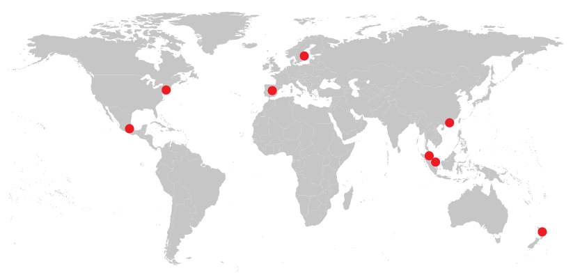
Astro was a broad-scope project: responsive website, iOS + Android phones and tablets. There were multiple screens sizes and devices to consider. We worked under very tight deadlines, alongside with many people across the globe and kept the communication intense between: Hong Kong, Singapore, Kuala Lumpur, Auckland, Madrid, Stockholm, Mexico and New York.
8 offices across the globe, providing 23/24 hours of continuous work.
Mission
Our mission was to redesign the existing application (AOTG 7), adding new features such as long press, purchase and binge-watching. The apps also had known UX issues for the on-boarding and sign-in flow that needed to be addressed.
I was initially responsible for designing the new experience of the website. It had to be fully responsive (based on Bootstrap framework). I eventually helped on the design of other platforms as well (Android and iOS).
I worked on:
- Information Architectures,
- Flow Diagrams,
- Wireframes, Prototypes,
- UI Design,
- Functional Spec Documents,
- Copy writing,
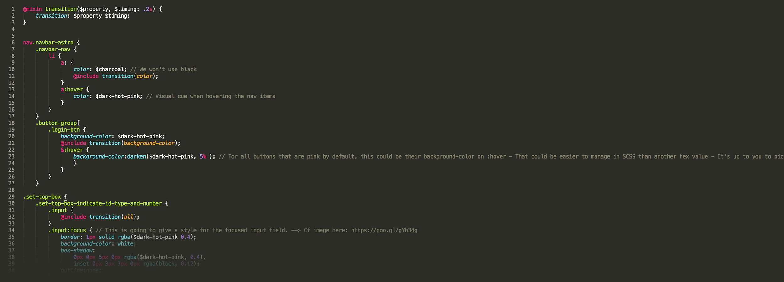
- Front-end code: I wrote some SCSS to hand-off to the Dev Team...
Communicating with developers early on
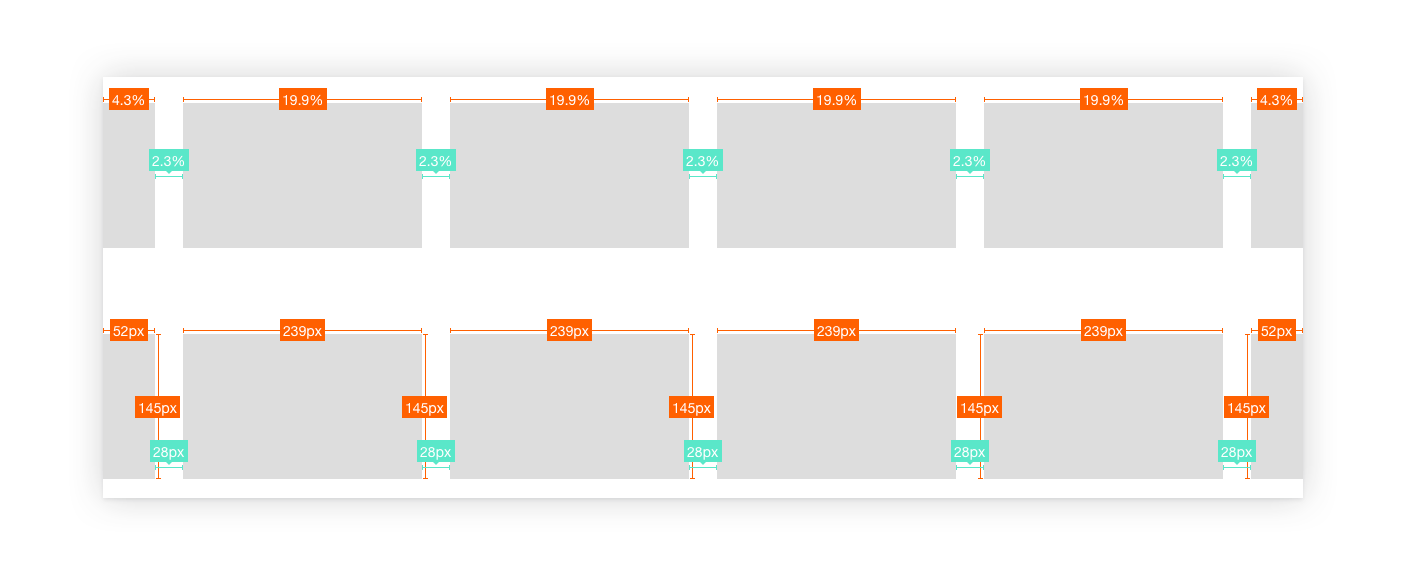
Prior to starting any UI work, I met with the team of developers and got their agreement on the feasibility of the layouts I was planning to craft. Below are samples of the specs document we discussed regarding the rails (rows of video content for users to navigate horizontally and select). Providing measurements both in pixels and percentages and for every breakpoint helped to determine whether it would be easily doable within the Bootstrap responsive framework.
Planning the component behaviour was aimed to ensure images and texts would always be readable, regardless of the end-user device. We also made sure that design components wouldn't get scaled inordinately in the case of very large screens.

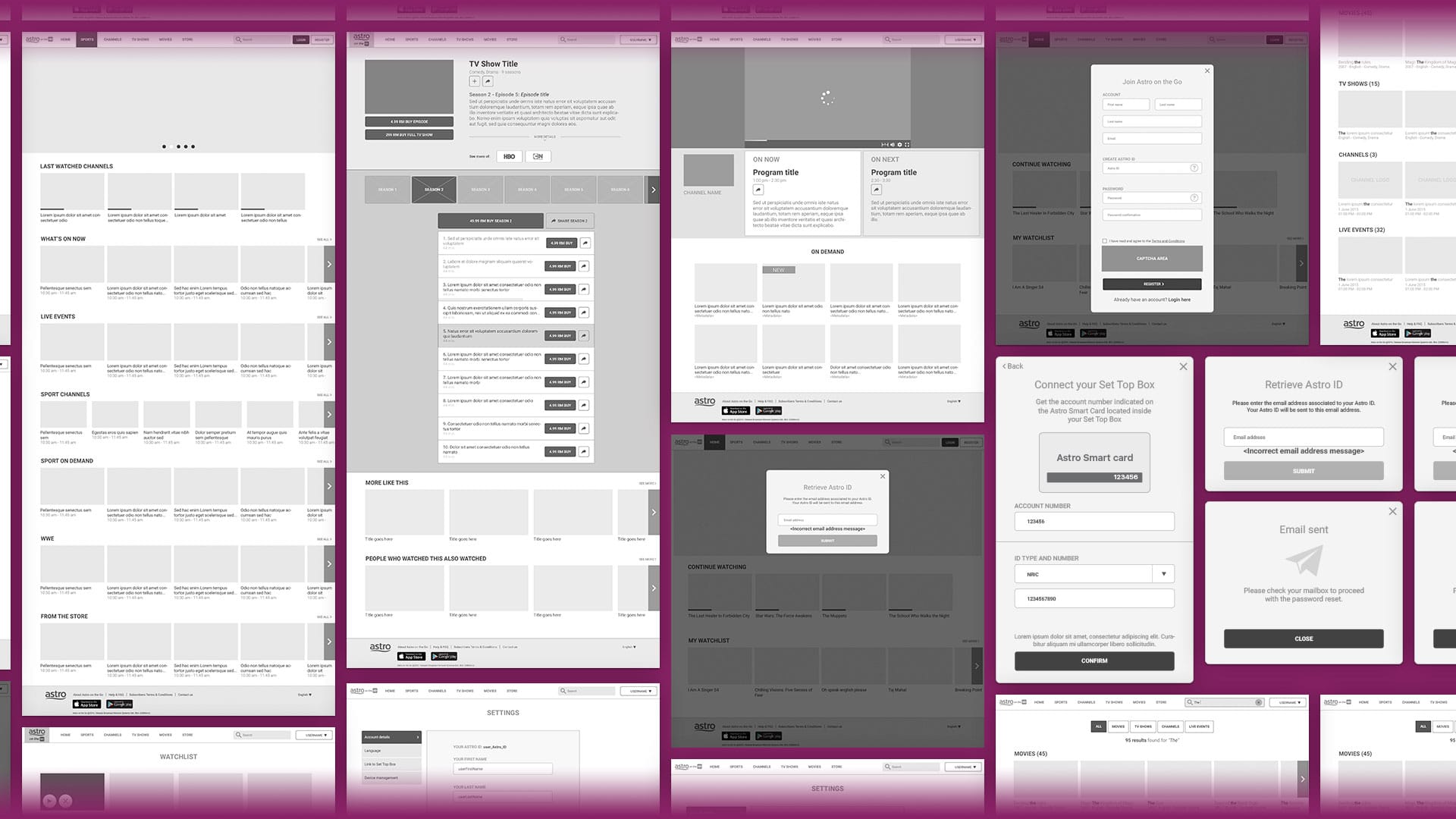
Wireframes
I created the wireframes for the responsive websites, which included 3 main breakpoints. The experience had to be consistent with the other platforms: iPhones, iPads, Android phones, Android tablets. Keeping the communication going between designers was key. Some design components and patterns could be similar across platforms on some screens but had to differ on others due to the different interaction model: more accuracy with the cursor on web, possibility to have hover states, text input made easier, etc.
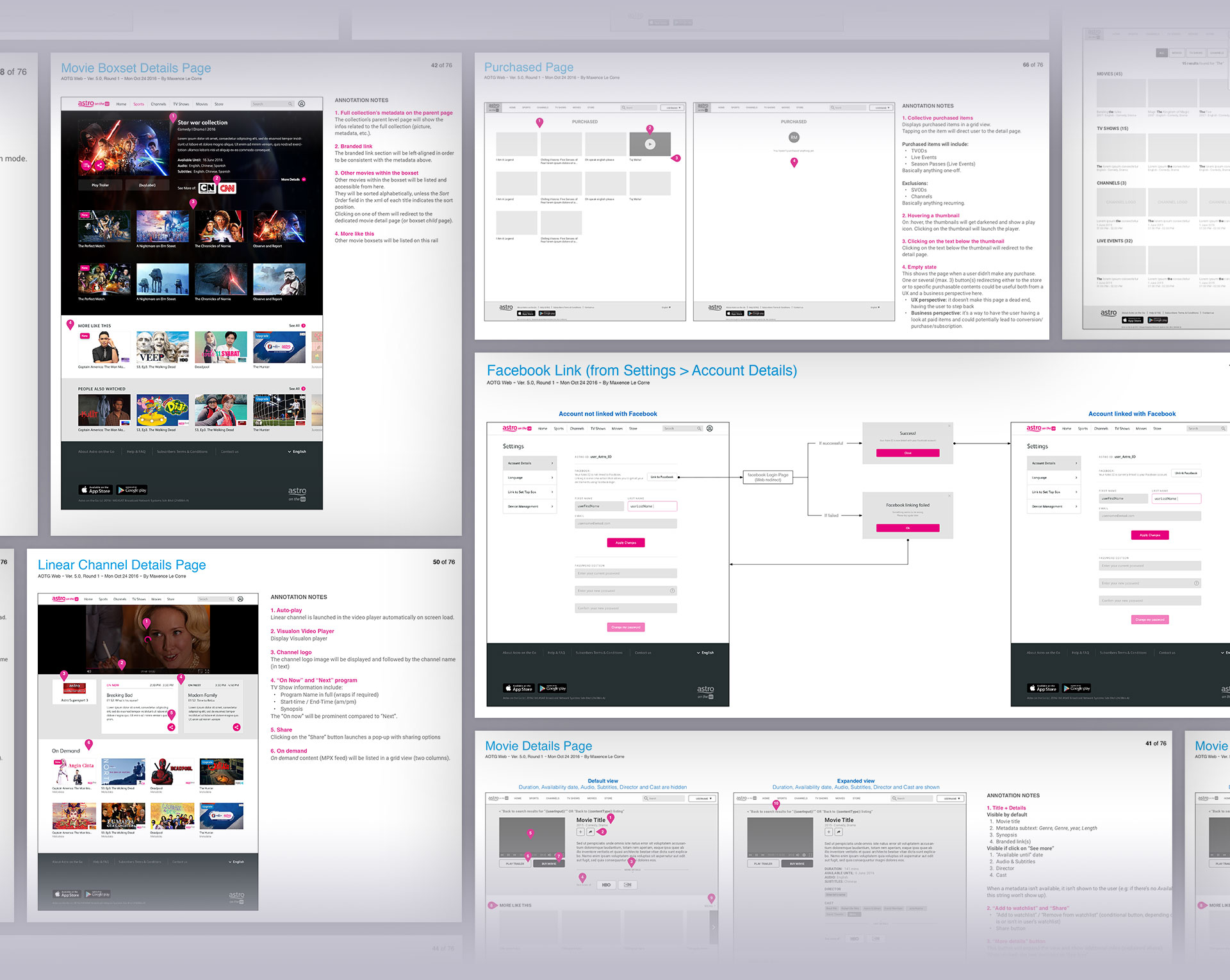
Functional Specification Document for the website
Explaining in details every component, flow and interaction.
Purchase Flow
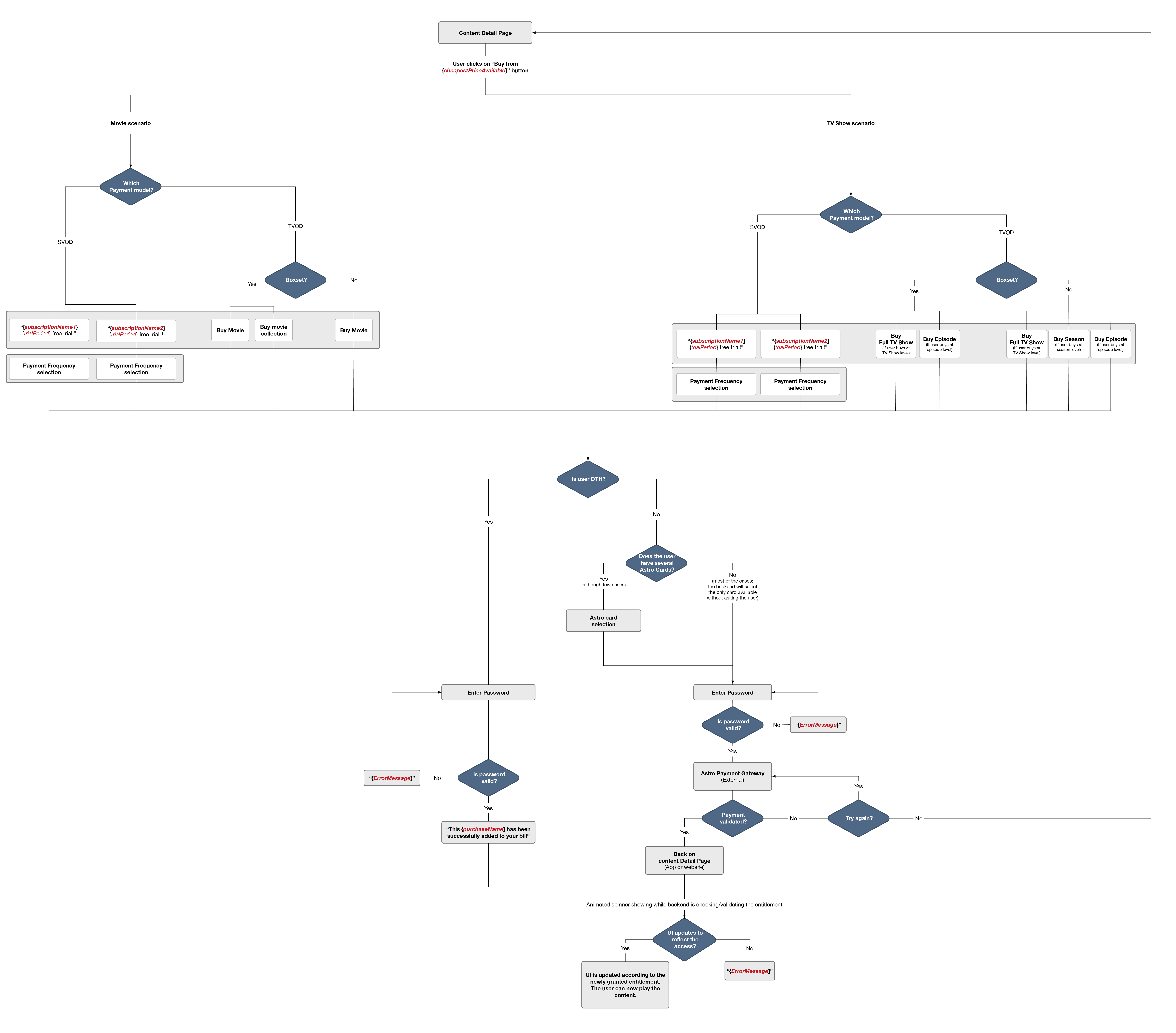
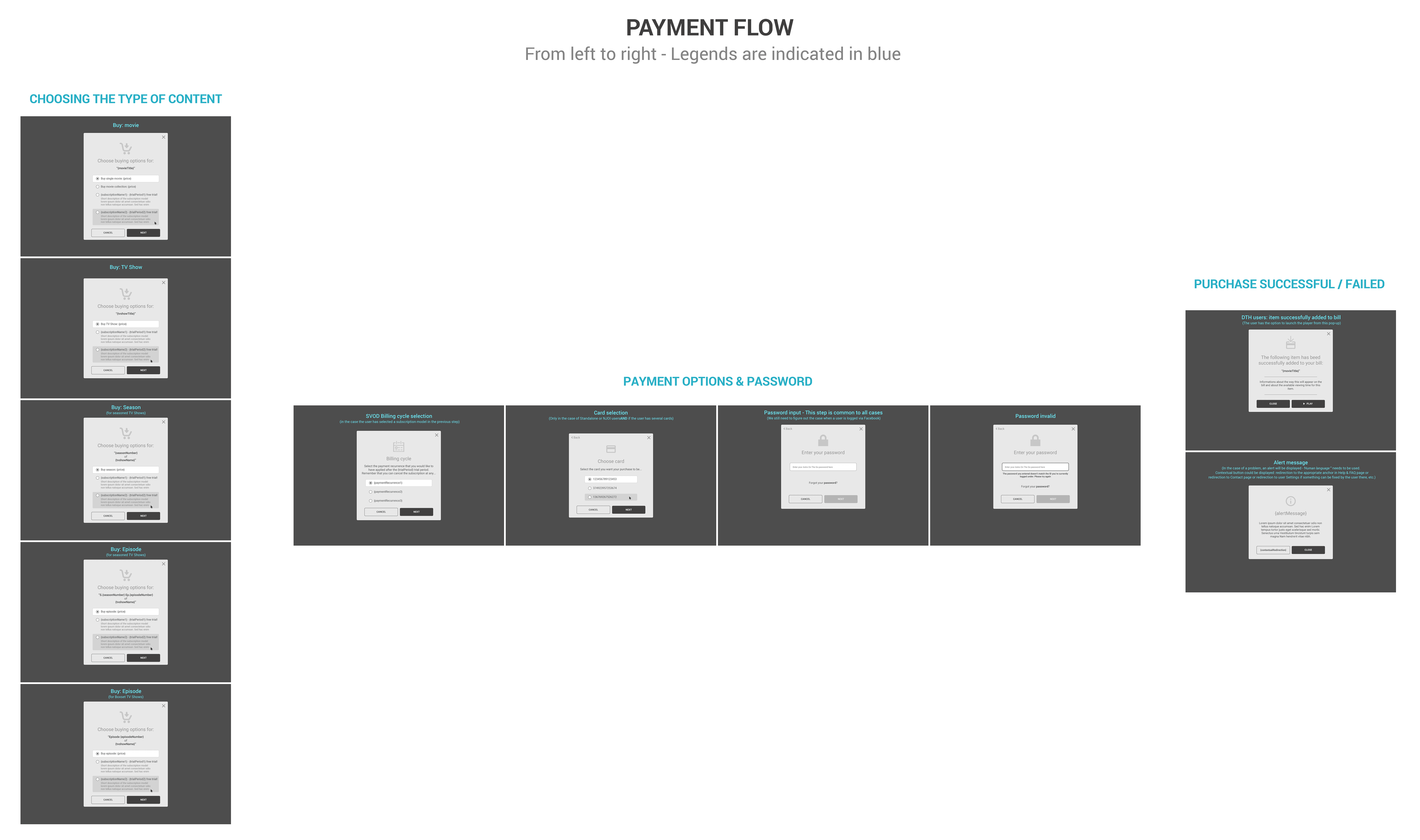
When working on video consumption platforms, we have to figure out the way the end users will purchase or subscribe to content. This piece of worked required close collaboration with the Product Owner and the Marketing Team in order to define what User Experience we wanted to design.
My process was the following:
- I mapped out the different scenarios on Flow Diagram so that we can match both marketing requirements and technical feasibility
- I then worked through several iterations of wireframes
- The team and myself could eventually proceed to the crafting the UIs.
UI Visual Design
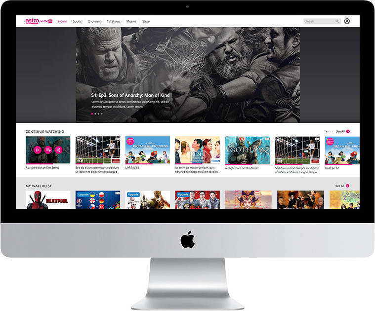
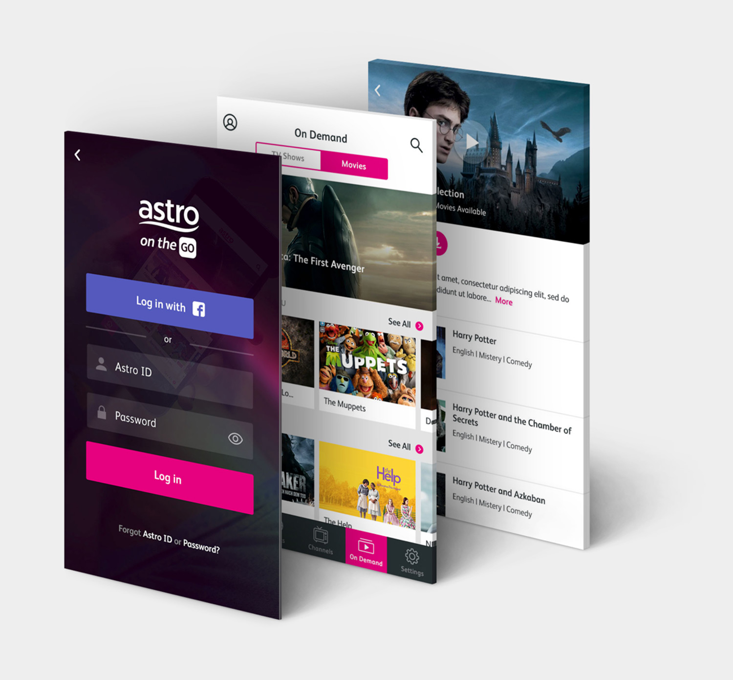
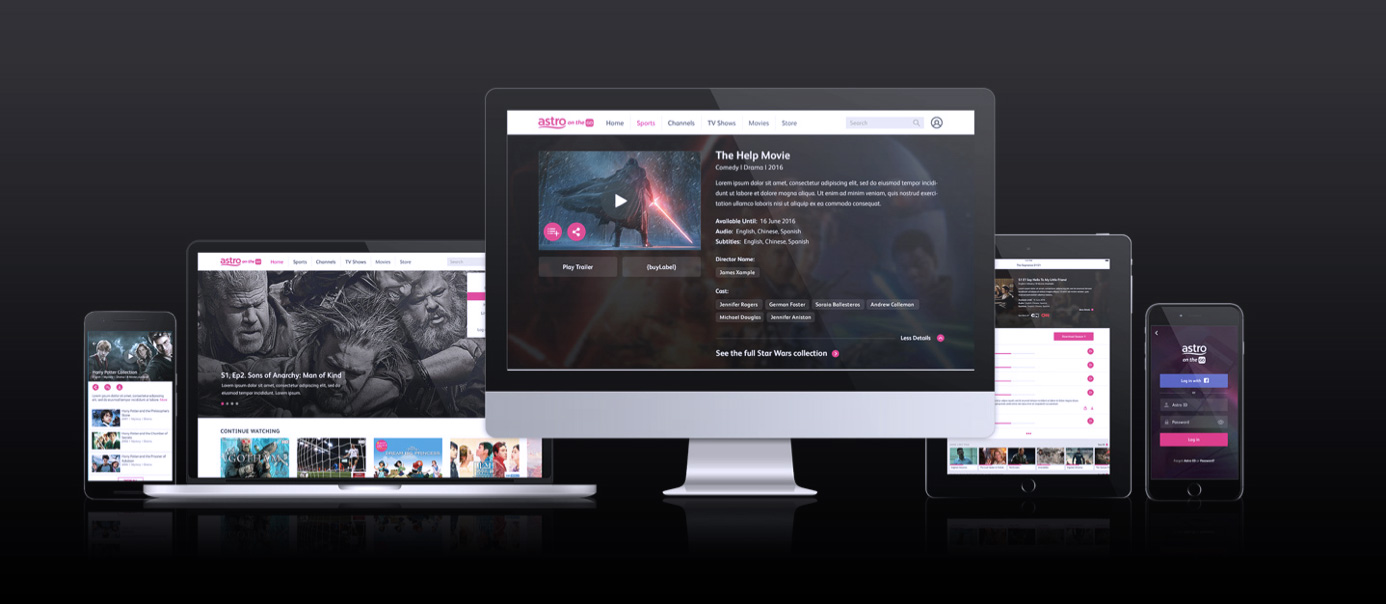
I worked on the UI design alongside other designers across the globe: New Zealand, Spain, USA and Sweden. We had to maintain consistency so that every style modification would be replicated on all platforms.
SCSS coding
Developers often have to focus on delivering a service that works, in respect to predefined user stories and within tight deadlines. Which leads to have visual enhancements, UI motion & animations often considered as 'nice to have'...
well...
actually often dropped and forgotten. By providing some SCSS coding, I could remove some of the hassle for them and get the design Q.A facilitated.
